Tuesday, December 28, 2010

pink gouache and a flexible nib

Months ago, I purchased 10 vintage nibs over at the Fountain Pen Network.  It came with a simple plastic nib holder, and this Christmas, my sister gave me this lovely wooden holder.  It even had this pretty marble-like paint of blue and green.  The slim wood rests well against the hand, and it feels so much better than plastic.  It is totally and undescribably thrilling!


I mixed up some pink gouache and brushed a good amount on the nib to start writing.  The nibs are not as smooth as my flexible fountain pens, and I really need to be careful not to puncture the paper.  Or let the paper get too wet that fibers come loose and snag onto the tip.  Which reminds me, perhaps I will need to find more suitable paper.


Nibs and holders are available from Scribe Writing Essentials.  The gouache I got from National Bookstore.  They have some in tubes and as well as in plates (ala watercolor).  Scribe also has calligraphy inks available.  There are also metallic inks that can be purchased as well from Fully Booked High Street.  Perhaps that would be my next project.

In the meantime, spread the Love.  Happy New Year!


Monday, December 20, 2010

reading the lines differently

Browsing through my favorite paperie sites, I'm always struck by how creative wedding invitations are getting to be.  Of course we will still be held by the sweetness of the traditional, but there's no denying that we'd all utter "I wish I could do that" or "I wish I did that" when faced with the contemporary work out there.  And I'm not even talking about passports or themed movie tickets. 

These are actually just simple new ways of looking at an invitation layout.  The smart combination of fonts and colors.  Yes, block wide letters can go with elegant flowing script.  From simple, to utterly overflowing with prettiness.  And mind you, they're still traditional letterpress.  Which is all the more lovely.


All works are from Thomas-Printers.  For more gorgeousness, do head on over to their site.

Thursday, December 16, 2010

the sweetness of fate


December 30, 2009
Theme: Classic with a touch of contemporary
Colors: canary yellow and pewter gray

Monday, December 13, 2010

what can you do with your monogram?

So your wedding is done and you can't quite let go of your monogram.  It's something from your special day that you could potentially see or use everyday... unlike of course your wedding gown (although personally, I wish I could wear it again, for one insane reason or another). 

Well, here are a couple of pretty ideas from Etsy that you could do with your wedding logo to make the memories last a wee bit longer:


Make it a wall decal on your home.  from Luxeloft.


Love reading?  Make it a stick-on bookplate.  from Oodles of Color.


Make it your official notecard and return address sticker.  from Le Papier Studio.


Have it made into a self-inking return address stamp.  from Purple Lemon Designs.


Adorn your living room with them as throw pillow covers.  from Fancy 4 U.

Sunday, December 12, 2010

classic wheat and wine


Alvin and She
Theme: Classic
Colors: matte gold and deep purple

Sunday, December 5, 2010

a pretty winter


Jeremy and Sharah
November 15, 2009
Theme: Winter, Elegant, with Damask details
Colors: purple hues, metallics

Wednesday, December 1, 2010

the december card is printable!


As a Christmas giftie to everyone, here are two gift tag layouts that are available for download.  The files are in PDF format, letter size with 10 tags laid out per page.  If you need a PDF viewer, you could download it here.  Free cheer and prettiness for everyone!

Calligraphy by yours truly :)

Spread the love!


Wednesday, November 24, 2010

romantic calligraphy


Flourished calligraphy or script may be a rustic touch you're looking for,
for your monograms, invitation cards or any of your paperie.

A pretty little service we'll be able to provide for you soon.
If you'd like a test, drop us a mail!

Thursday, November 18, 2010

autumn love


Jett and Eden
October 20, 2010
Theme: Autumn, Romantic, Rustic
Colors: orange, mustard and pumpkin hues

Monday, November 8, 2010

Zac Posen Resort 2011

I'm such a little girl for delicate and dainty details.  When I saw Zac Posen's 2011 Resort Collection, I fell absolutely in love.  The softness is adorable.  The lightness screams femininity.  I imagine an entourage walking by the seaside, with draped tulle being swayed comfortingly by the salty breeze. 


images from: Vogue (Australia)


If not a beach wedding, the prettiness could very well fit a nice garden ceremony, filled with little spring flowers and accented with lovely crochet details.  Oh, the sweetness is overwhelming.

Spread the Love.

Thursday, October 28, 2010

sweet fruity colors


Delio Jr. and Lani
Theme: Sweet & Romantic
Colors: pomelo pink and apple green

Monday, October 4, 2010

muted spring

I still owe the October card, I know.  However I was just struck by the loveliness of the Spring 2011 collection of Lanvin, particularly this ensemble.  It's got that carefree-ness of the season without the brights or the petals.  It's like the light breeze carrying little leaves that suddenly turned into a dress.  It's got enough sunshine to make you feel sunkissed without making your audience squint.


Me thinks it is a potential color palette for a nice quaint wedding (or a big yet warm gathering).  Some kind of mustard, with an old mint green.  Paired with other pretty things surfed across the web, I'd actually love this for a wedding!  If I could ever have a second ceremony, this would be my theme!


Mustard Clutch from The Travelling Cabinet.

Letterpress Invitation from Save the Date Invitations & Annoucements.

a Garden-themed bouquet, taken by Erin Wallis Photography.


Paper Lanterns as ambient lights, taken from The Free Wedding blog.

Sunday, September 26, 2010

carnation pink


Kiko and Tine
November 18, 2009
Theme: Classic
Colors: carnation pink, lime green

Sunday, September 19, 2010

calligraphy logo design

Since having uncovered my old calligraphy set and my dad's old fountain pens, the fingers have not stopped clicking on different calligraphy and FP websites.  Links and links later, I happily stumbled upon the lovely, lovely portfolio of Paperfinger.

It's really nice to see how the art of beautiful hand-written words is very much alive.  And their modern take on calligraphy is so refreshing while still maintaining that old, romantic charm.  I've noticed that a lot of weddings abroad still address envelopes and even invitations or thank you cards by hand, and I do hope that the raw appeal of such things hop on over to our shores.  It's one thing to use a calligraphy-inspired or handwritten font (don't get me wrong, I'm an avid fan of these types), but it's another thing to actually feel and see ink done by hand.  I feel that it adds a little bit of love and passion.  I am wishing that in my quest to study lettering and calligraphy, I could open a similar service here (wish wish wish!).

Anyway, to the actual feature of this post.  I'm reposting some of the shop's work on logo design, that I hope will inspire soon-to-be-wed couples (and me!). 


all photos are courtesy of: Ash Little Photography


Wednesday, September 15, 2010

contemporary canary


Ferdie and Sarah
December 23, 2009
Theme: Simple, Elegant, no frills
Colors: blue and canary yellow

Tuesday, September 14, 2010

the art of handwriting

I've always been a paper and notebook whore.  And because of that, some kind of a pen-whore as well.  I remember when text messages were too expensive to send a little "hello" to the person sitting just next to you.  And there was that lady at the pager company who always got your messages wrong.  So the best thing was to pass colorful post-its with handwritten notes of nonsense, with a secret prayer that it won't be intercepted by your buttoned-up professor.  Soon, we got sick of just black and blue pens.  And those scented ones were okay at first, but later on drove our sinuses up the wall.

Then, someone discovered colored gel pens.  And then they even had some with glitters.  It was like writing with nailpolish.  Or trying on a whole palette of lipstick all at the same time.  I remember having a whole satchel of different brands, of all possible shades of purple and gold.  The white pen over black paper was such an innovation, it was like walking on the moon.  I was later given a set of calligraphy pens and parchment paper which I enjoyed thoroughly, until it just wasn't "in" enough to compete with the neon pinks and greens of the ballpoint world.

Somewhere along the way, writing by hand became a chore.  And those lovely pens got stashed in some obscure drawer in our attic.  We exchanged emails for cards, text messages and chat for letter narratives.  My prolific notetaking was replaced by frantic typing (I'd like to thank my piano lessons as well for my finger dexterity).  At some point, writing was just painful.


But, passions will always find a way to creep into your life, I suppose.  Preparing for our wedding, we decided to address our invitations by hand, instead of printing on stickers or feeding the envelopes into the printer.  Also driven by the fact that the paper we chose isn't printer-friendly.  So there I was, buying calligraphy pens and writing on 200++ envelopes.

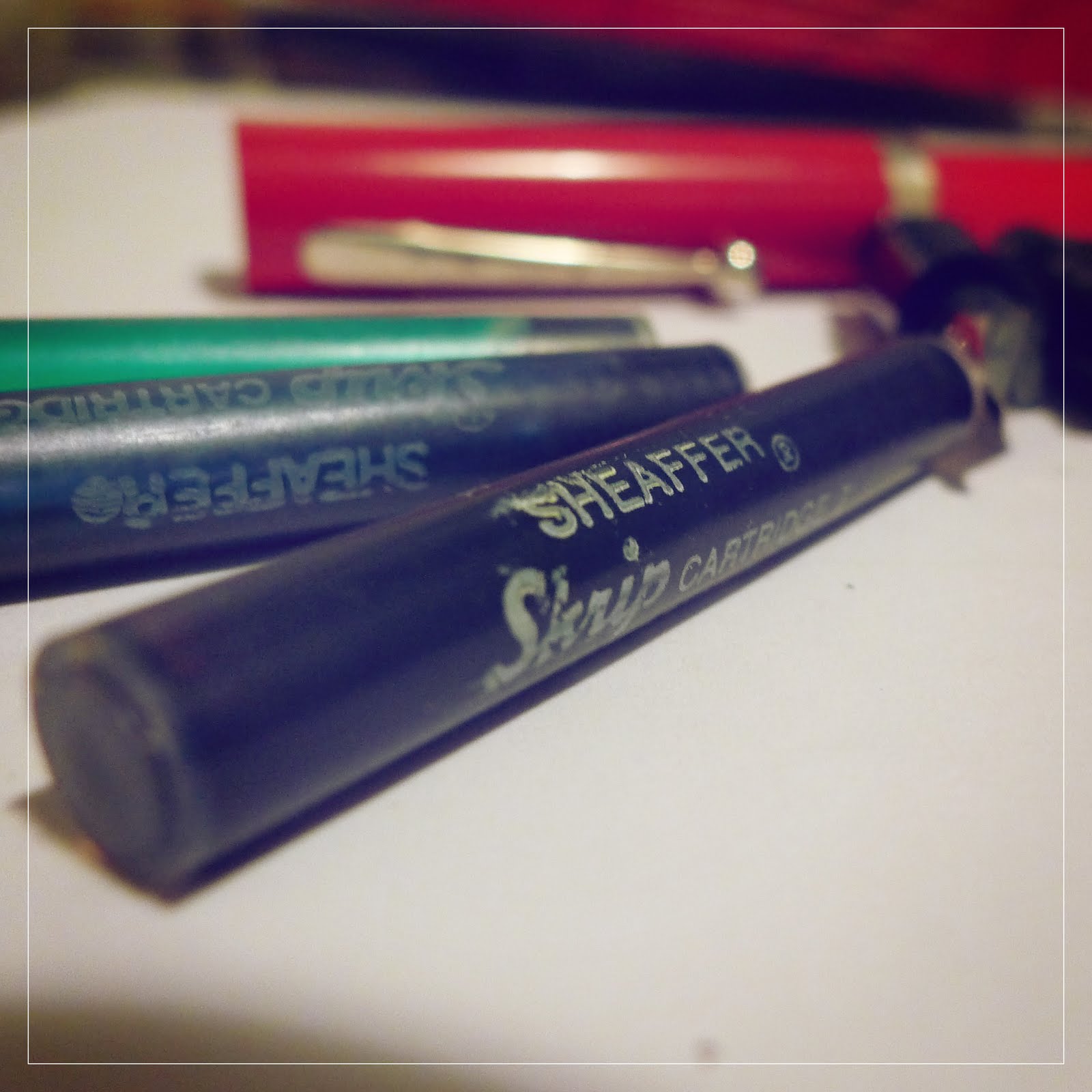
And now that the wedding's done, here I am back-stroking in thousands of typefaces to design custom logos for soon-to-wed couples.  The love for beautifully written and designed letters reawakened, and I'm enjoying it immensely.  I remembered the old calligraphy kit I had when I was in high school and decided to take a chance at looking for it in our attic.  Lo and behold, it's still there!  Nibs are still okay, the plastic pen casing still intact and the inks are still liquid (miraculously).


Right now I'm itching to go home and practice with my old-new babies.  I can imagine ink-blotted pages and dye on my pinky's knuckles.  It's so exciting (and refreshing), welcoming the art of writing back into my life.

Who knows, maybe I'll expand to hand-written invitations and logo designs.  Tee hee.

Spread the Love, guys.  The art should be here to stay.

Monday, September 6, 2010

S is for September


S is for the sweetness, the swirls and the soulful winds of our formal entry into the holiday season.  I was actually working on this monthly card while a storm was asserting itself outside.  The palette began as a mix of grays, blues and ecru.  But then again, it began to feel like a double-dreary interpretation of the moment.  For some reason, fate wasn't allowing me to be that depressed.  Staring at the monitor with penmouse in my hand, I was stumped.

And so I brewed a cup of coffee, sat back and took deep breaths.  My fingers decided to overhaul the theme with something dainty and feminine.  And in a matter of minutes, here it is.  The September card.

Spread the Love. 


Friday, August 27, 2010

w@w and our new email

I'm excited to say that you'll find our logoswithlove ad within the next Weddings at Work Primer!  It's actually great to be part of such a wonderful network.  Having been a "wawie" myself, I'd want to pay homage to all the help and warmth my fellow bride-to-be's gave.  It's an overwhelming sea of support, especially during the inevitable stresses of wedding planning.

The network also served as a great launching point for this passion of mine - logo design and illustration.  LogoswithLove wouldn't have been born without it!  So cheers to Ma'am Benz, for allowing such a world of friendship to be created and grow.  And to all the bride-to-be's out there, don't forget to breathe!


On another note, I've created a new email address for LogoswithLove orders and inquiries.  Yey!  To ensure that service is provided timely and requests are received without risk of getting mushed up in my personal emails.  Payment scheme remains to be via bank deposit.  All negotiations will have to be initiated via the email above. 

That's all for now.  Share the love!

Sunday, August 22, 2010

cherry flavors


Prijm and Karla
Theme: Classic and Clean
Colors: maroon, red and pink

Monday, August 16, 2010

a little spring feeling


Alvin and Jonah
Theme: Classic, a little bit spring
Colors: a refreshing duo of aqua blue and apple green
Related Posts Plugin for WordPress, Blogger...