Thursday, February 24, 2011

a different kind of blue

I made these mood boards to help a reader a few weeks back, and I think it would be nice to share.  They were going to have a December wedding, and were thinking of using blue as their main color because it was "winter" and all.  I have nothing against blue and silver as a combination because many weddings have used that palette for very elegant winter themes.  However, the many-ness of it makes me enjoy looking for refreshing new options.

She (reader) was undecided about her color palette and emailed me together with a monogram test request to make some recommendations.  Basing it from a key photo that had blue as the dominant tone, here are some blue alternative palettes you bride-to-be's might want to consider.

A cool, clean slate.

It's somewhat periwinkle, a deep grey-blue with a tinge of purple.  Add a punch of contrast with charcoal and ivory as your highlight hues.  The palette is very polished, and is versatile enough to go from minimalist-contemporary to ornate-victorian.


A sunny winter afternoon. 

The board is a warmer, more playful combination because of the dash of yellow mixed into the palette.  Making for teal and mustard as your key colors.  And a light, brown-grey to anchor the theme.  I could so imagine this as a garden or beach wedding, or even a chic set-up in a rustic ballroom.


Thursday, February 10, 2011

happy hearts at Heima

Headline calligraphy by yours truly :)

for more details, read this month's heima newsletter
and see more lovely, pretty things at their online store.

Saturday, February 5, 2011

sweet lotus love


Ken and Elaine
January 22, 2011
Theme: Contemporary, with a lotus flower
Colors: chocolate brown and pink

Wednesday, February 2, 2011

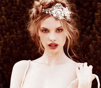
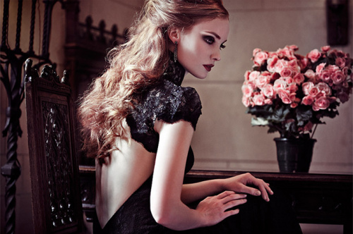
are you romantic or dramatic?

Found these lovely make-up tutorials whilst tumbling along my Tumblr dashboard.  I personally couldn't do a smokey eye to save my life.  So I vowed to have one for my wedding, even if it was 8 o'clock in the morning *grins*.  

I believe that make-up is just as important as the wedding dress you're going to be wearing.  And meeting "the one" is just as vital as the groom you'll be wedded to.  Even if the make-up test does cost quite a bit of money, I would highly recommend it especially if you haven't worked with them before.  It's the only way you could really get a feel of the person who'll be painting your face for this fairytale day.  Shortlist HMUA's based on their portfolios, and do the test.  As much as two, so you could see which one will really understand you.

In the meantime, perhaps you could practice on yourself (since we girls love doing that anyway).  Video tutorials are the greatest.

Romantic English Rose tutorial here.

Two tutorials for the dramatics:
Rock-ish tutorial here,
and the Red Velvet tutorial here.


hand-lettered envelopes

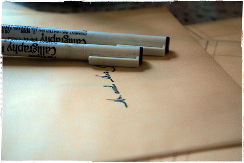
My best friend and I just rekindled the card-writing exchanges we used to do back in high school.  It's extra exciting for me now since I could do calligraphy to address my card.

I used an Esterbrook 761 flexible nib and a varying mix of blue and pink gouache to create different shades of purple as I wrote along.  For my address, I chose to stick with pastel pink. 


I secretly wish I had the power to turn back time to when I was doing the addressing for our wedding envelopes.  All I had was a felt-tip italic nib, which did the job, really.  But it missed the elegance of flowing ink.  Or maybe I'm just blaming my lack of script technique on the felt.  Or maybe there is something to silver vs. felt.  


Nonetheless, if you'd like to have hand-addressed wedding envelopes or any form of calligraphy for your wedding (or whatever event you may have), do drop me a mail.  We could chat, I could do a demo, show you the nibs.  I could do the same if you just wanted to learn as well.  

In the meantime, spread the Love.  Let's write, people.  It's pretty.

nature lovers


Carlo and Lia
Theme: Nature, Contemporary
Colors: teals and greens

Related Posts Plugin for WordPress, Blogger...